Spotter
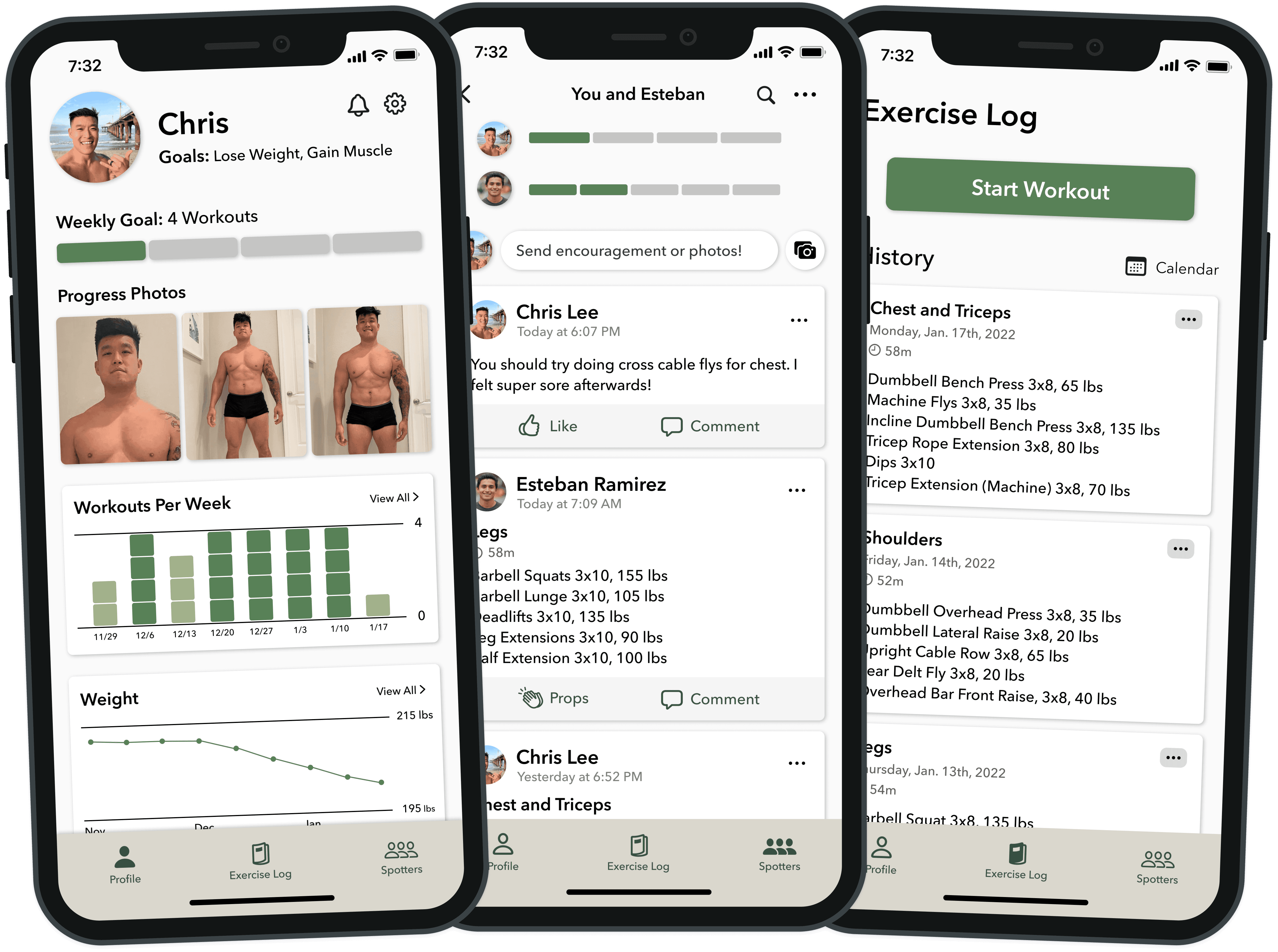
A mobile app helping users reach their fitness goals through shared accountability
Problem
Solution
Process
Research
What are users’ fitness goals and how do they achieve these goals?
While many people use fitness apps to improve their exercise experience, many people who use these apps still struggle to achieve their personal fitness goals. Through conducting user interviews, I found that people may fail to achieve these goals for various reasons, including losing motivation, struggling to fit exercise into their schedule, and unhelpful eating and exercising habits, among other reasons.
User Goals
Broad fitness goals
Get stronger
Get leaner
Get toned
Exercise certain amount of times per week
User Obstacles
Lack of discipline
Discouragement from lack of results
Balancing fitness goals with other priorities
How Users Stay Motivated
Sharing workout plans and progress with someone else
Documenting workout details and results
Having a consistent workout schedule
How do users utilize fitness apps to achieve their fitness goals?
Documenting exercise activity
Sharing exercise activity with friends
Viewing friends’ exercise activity for motivation
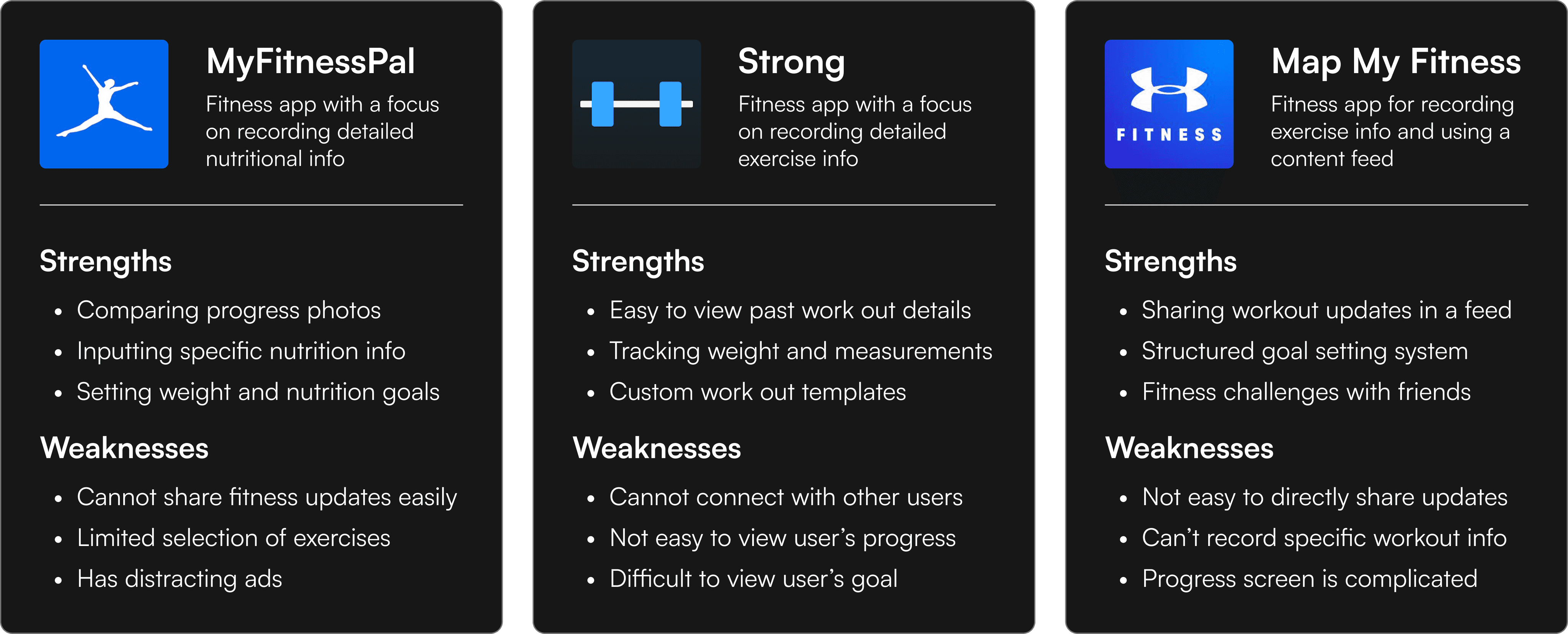
Competitor Analysis
Persona
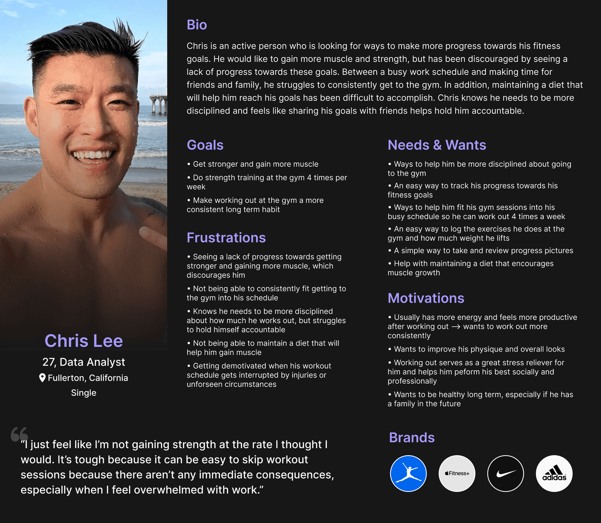
To have a clear idea of users’ needs and pain points for reference moving forward, I used the information from user interviews and competitive analysis to create a user persona.
Ideate
How can we help users overcome their obstacles to achieving their fitness goals with an app?
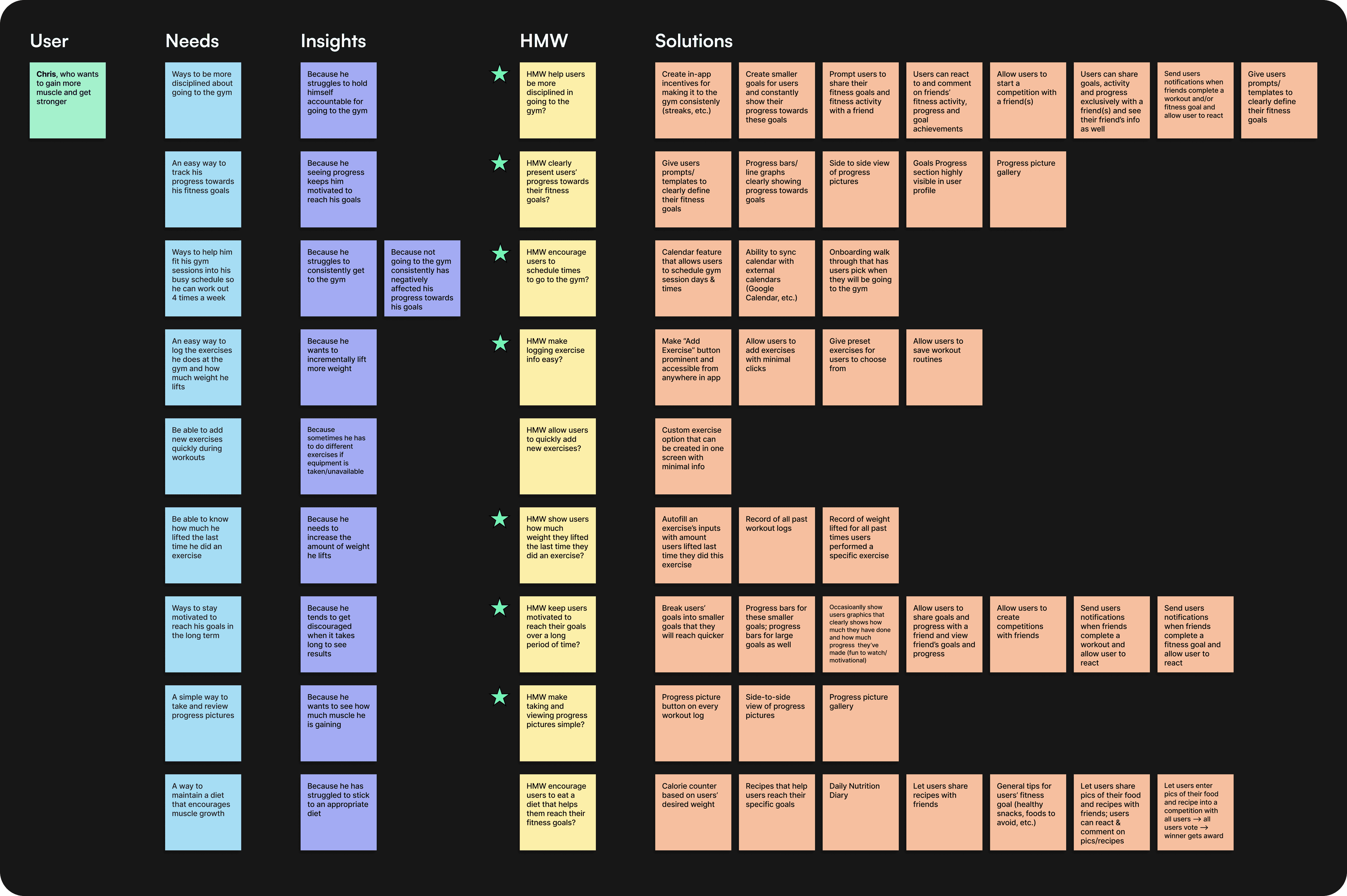
After conducting research, I created a “How Might We” board to brainstorm solutions to user needs that I had identified.
Most Important "How Might We" Statements
How Might We help users be more disciplined in going to the gym?
How Might We clearly present users’ progress towards their fitness goals?
How Might We encourage users to schedule times to go to the gym?
How Might We make logging exercise info easy?
How Might We show users how much weight they lifted the last time they did an exercise?
How Might We keep users motivated to reach their goals over a long period of time?
How Might We make taking and viewing progress pictures simple?
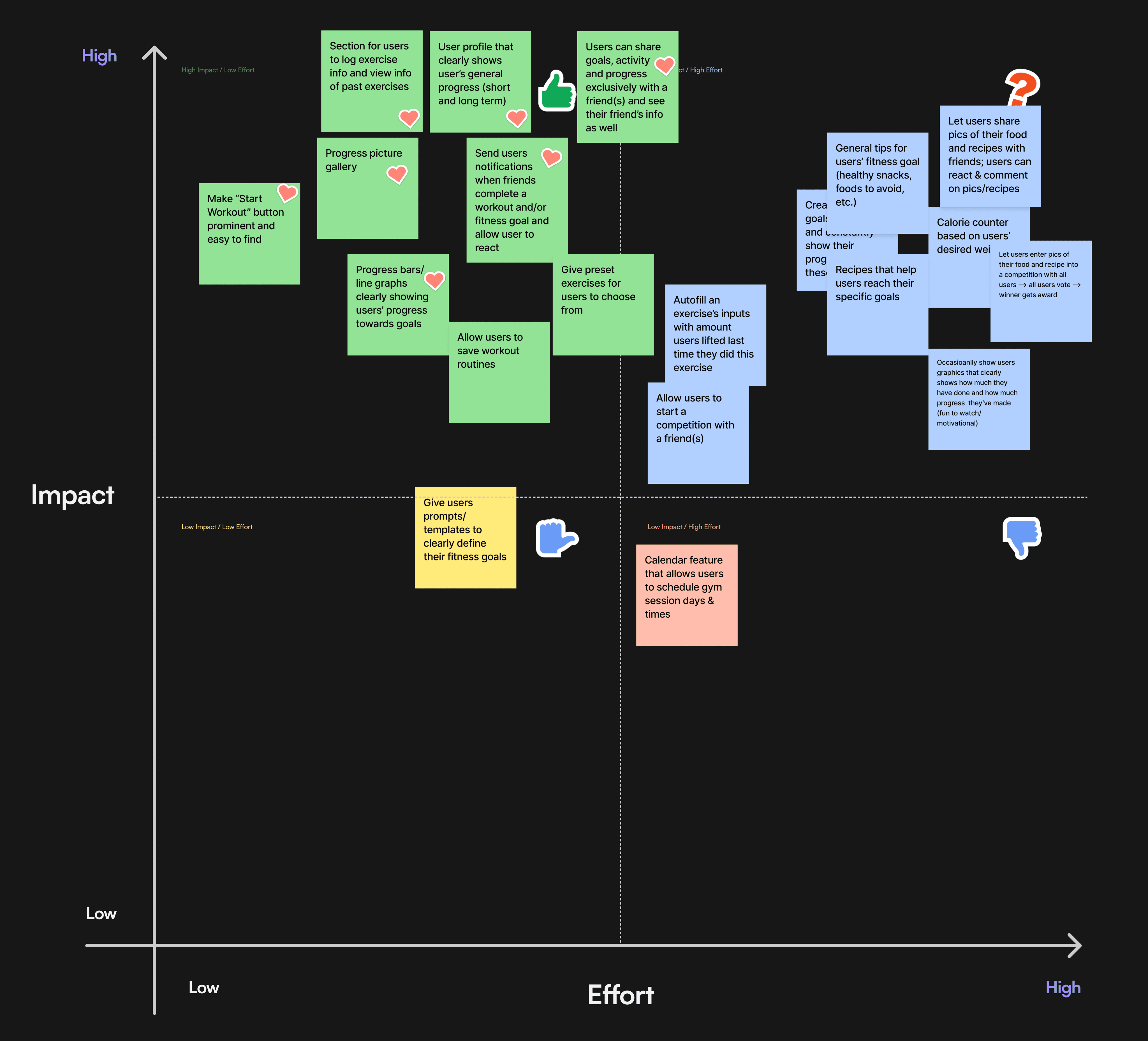
To meet this project’s time deadline, I needed to prioritize which of these solutions were most important and feasible to implement. I sorted the most prominent solutions into an Impact/Effort Matrix to help decide which solutions should be prioritized for the MVP of this app (marked with red hearts).
Solutions
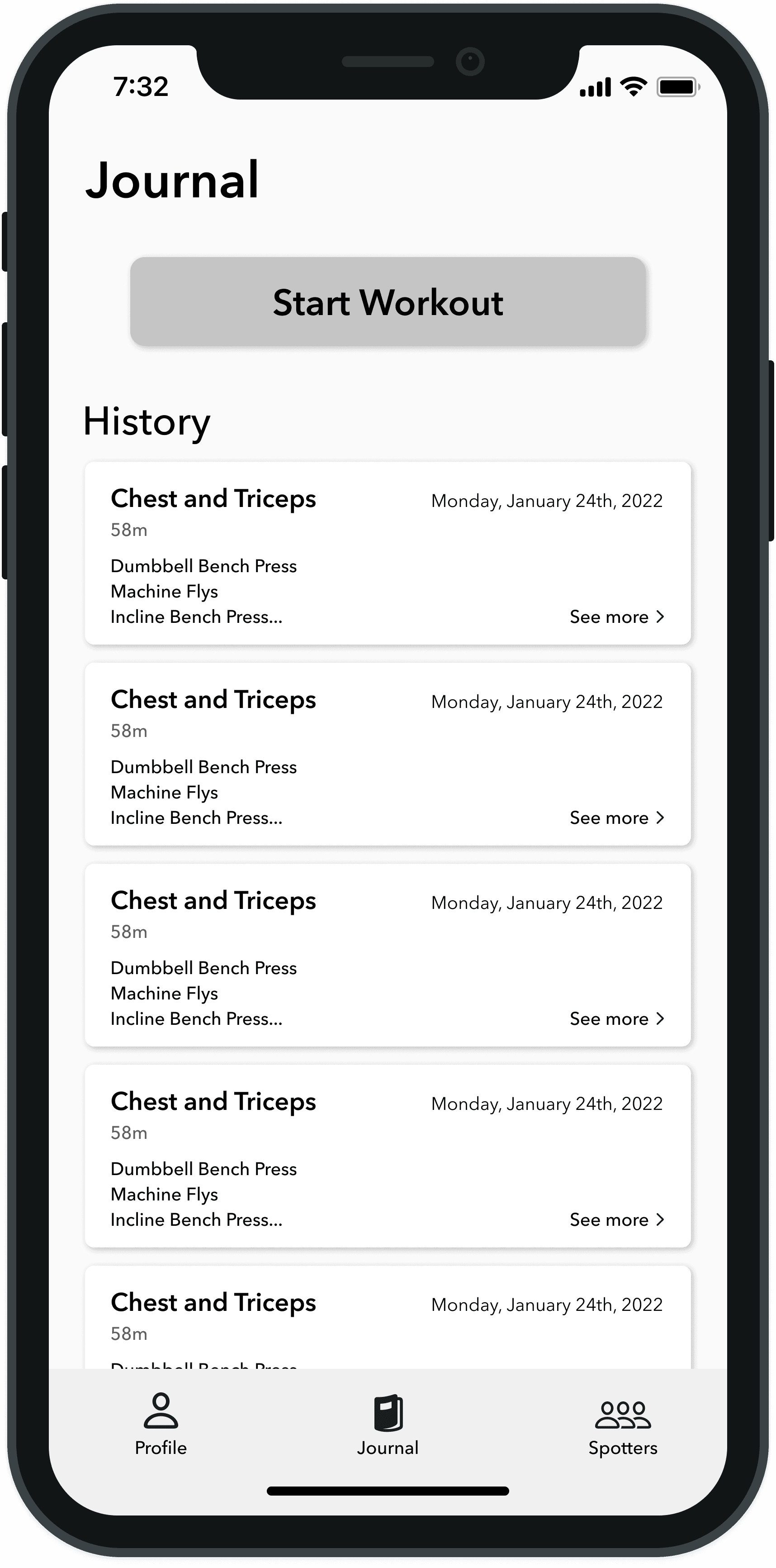
Section for users to log exercise info and view info of past exercises
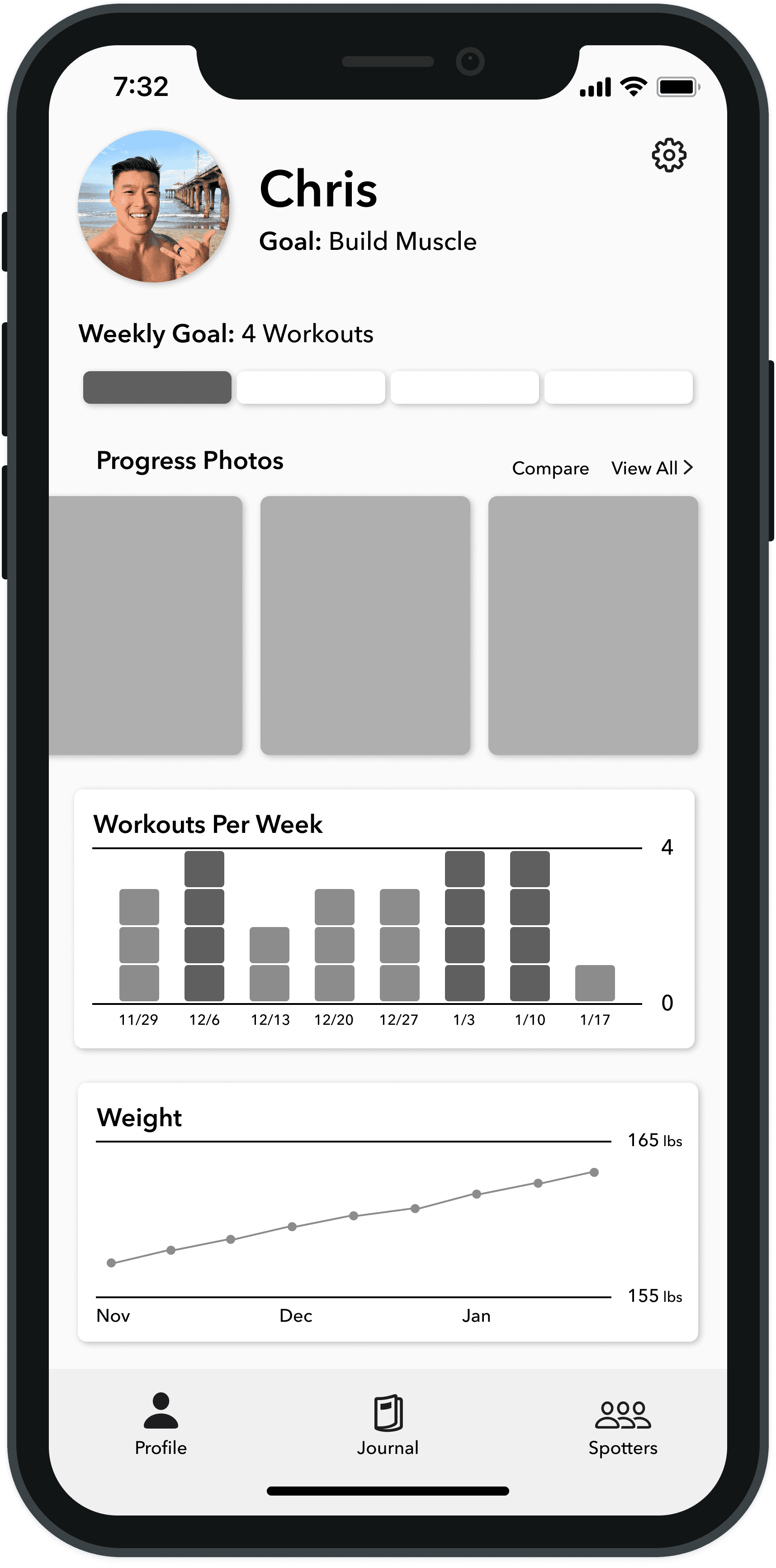
User profile that clearly shows user’s general progress (short and long term)
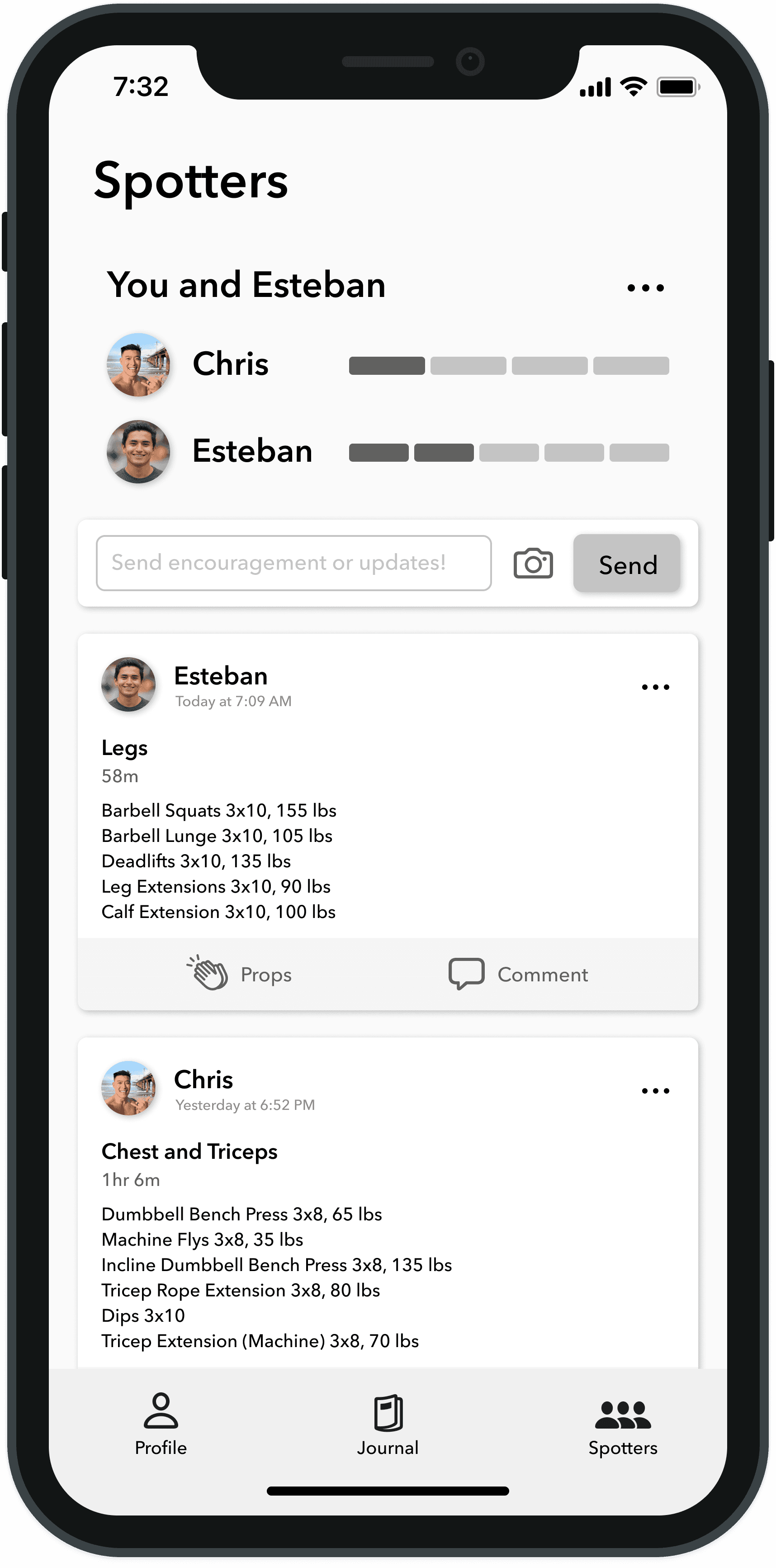
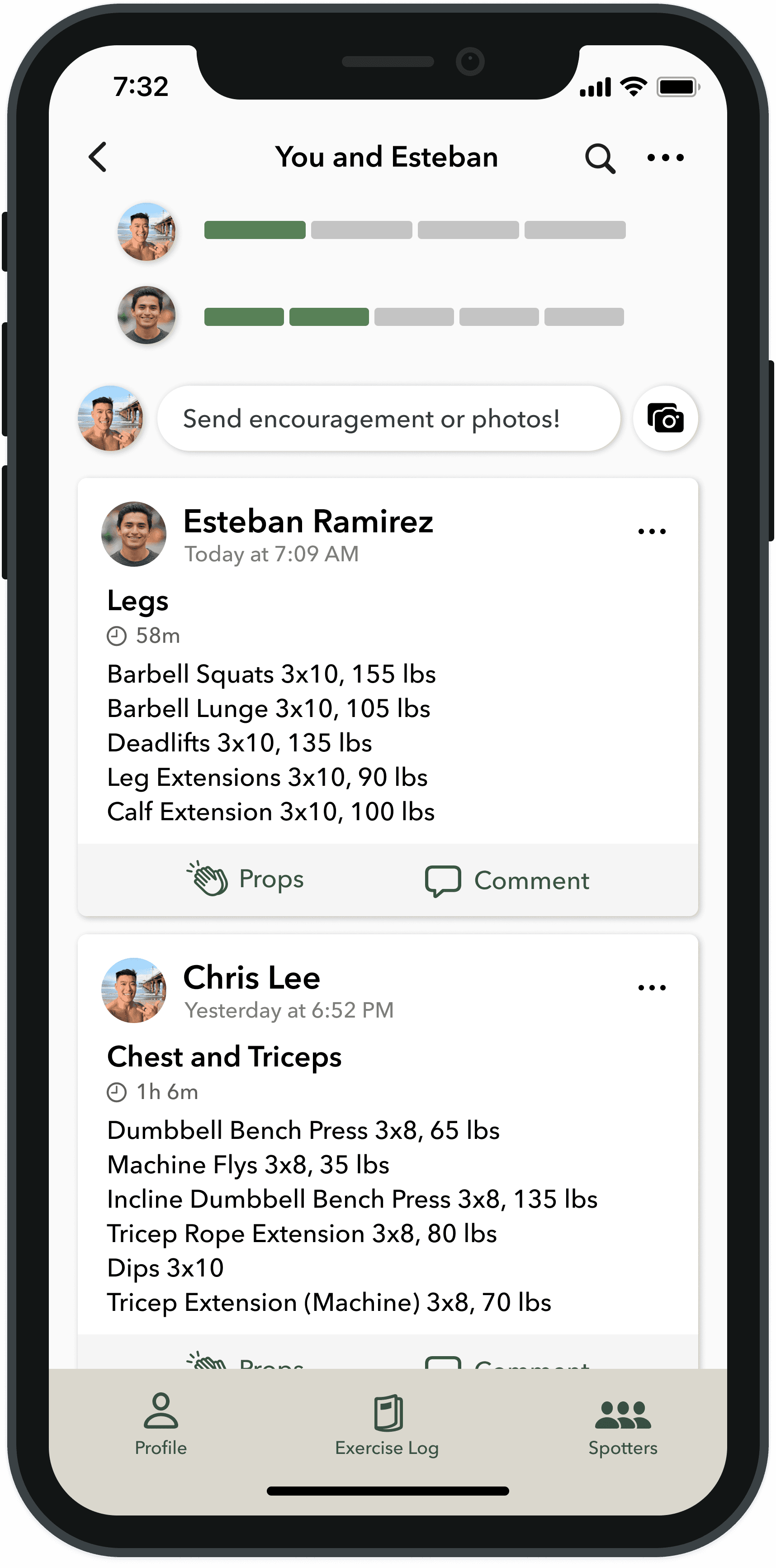
Users can share goals, activity and progress exclusively with a friend(s) and see their friend’s info as well
Send users notifications when friends complete a workout and/or fitness goal and allow user to react
Progress bars/line graphs clearly showing users’ progress towards goals
Progress picture gallery
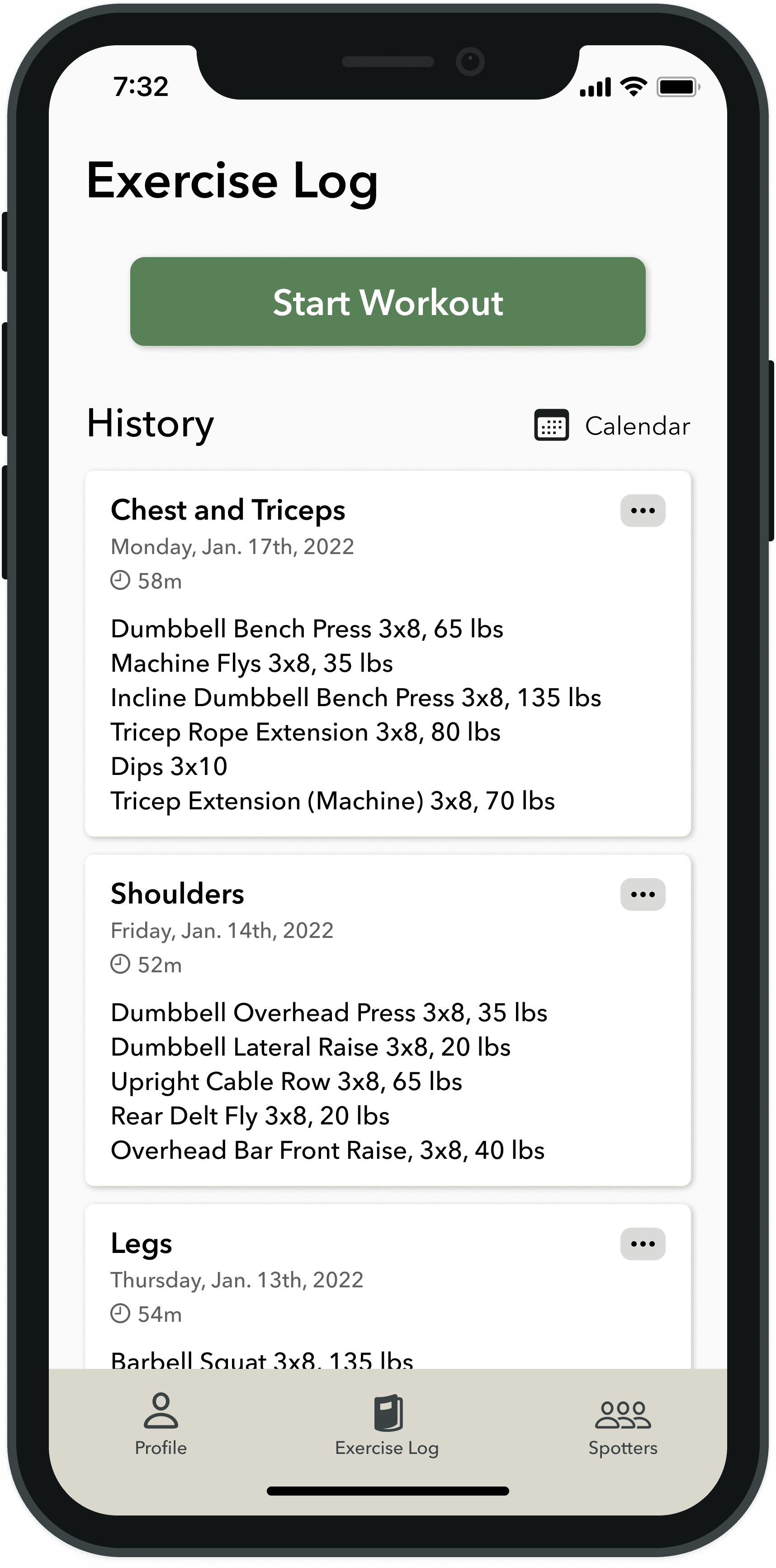
Make “Start Workout” button prominent and easy to find
Now that I had some solutions sorted out, I began to organize the information architecture of the app
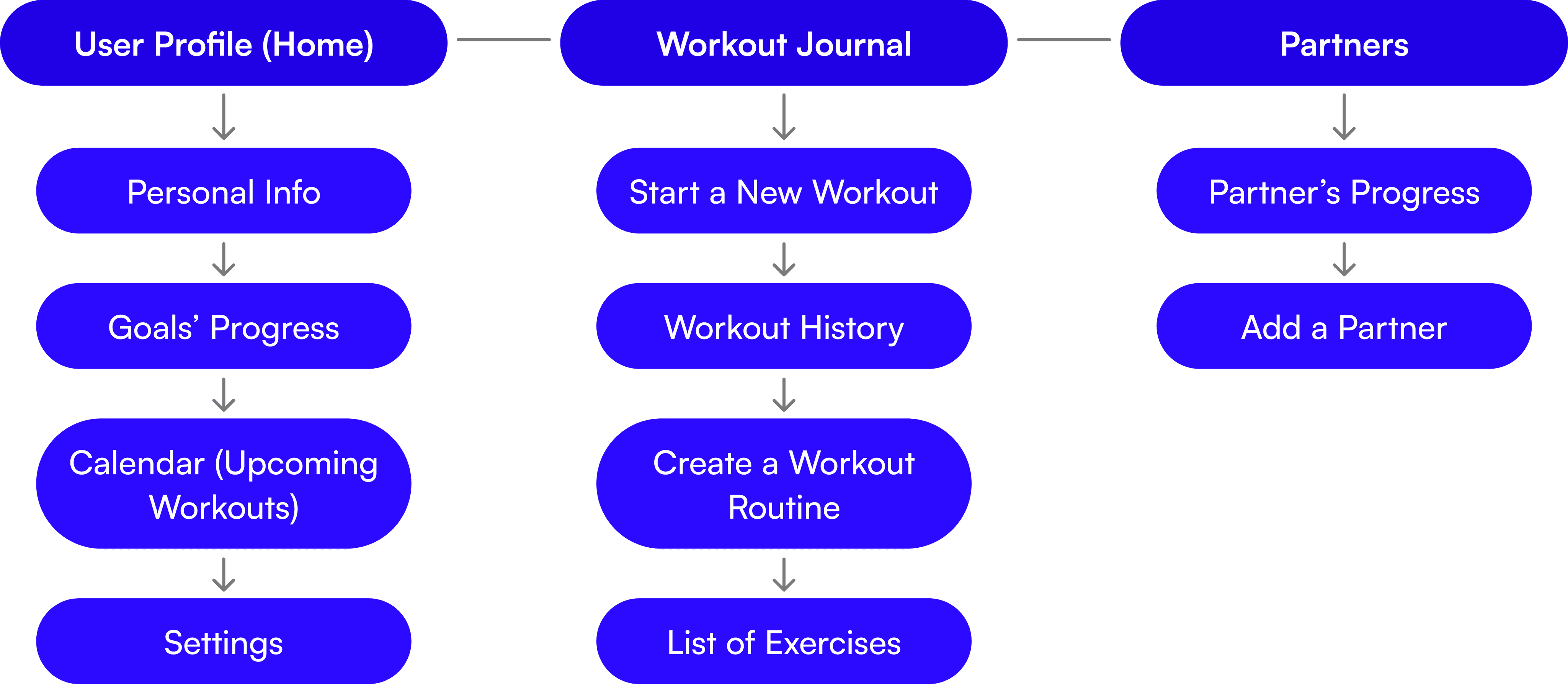
Since users had shown that viewing their fitness progress, logging workout information, and sharing their exercise plans and progress with friends were critical to achieving their goals, I sorted this app into three sections based on these topics. In addition, creating a simple interface that is easy to navigate was important since parts of this app are meant to be used while exercising. I created a site map to design this layout in more detail.
Site Map
Usability Testing
After creating low-fidelity wireframes, I created a Mid-Fidelity prototype in Figma. I then tested this prototype through Maze.
Usability Test Information
10 participants
Average age of participants: 29
All users regularly exercise
All users regularly use a fitness app
Usability Test Goals
Understand if users can easily go through the onboarding process
Understand if users can easily view their past workouts
Understand if users can easily navigate to the “Spotters” section
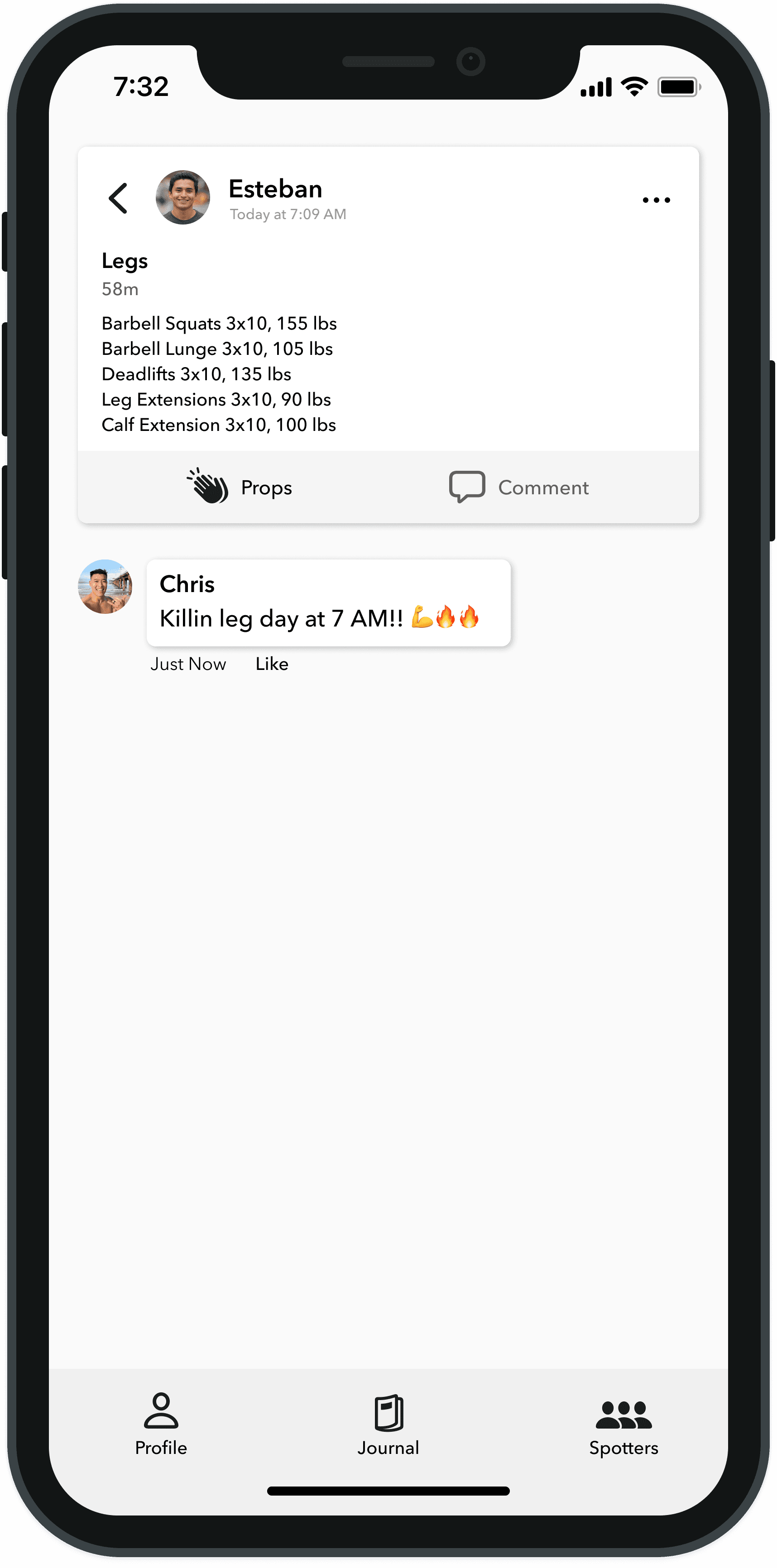
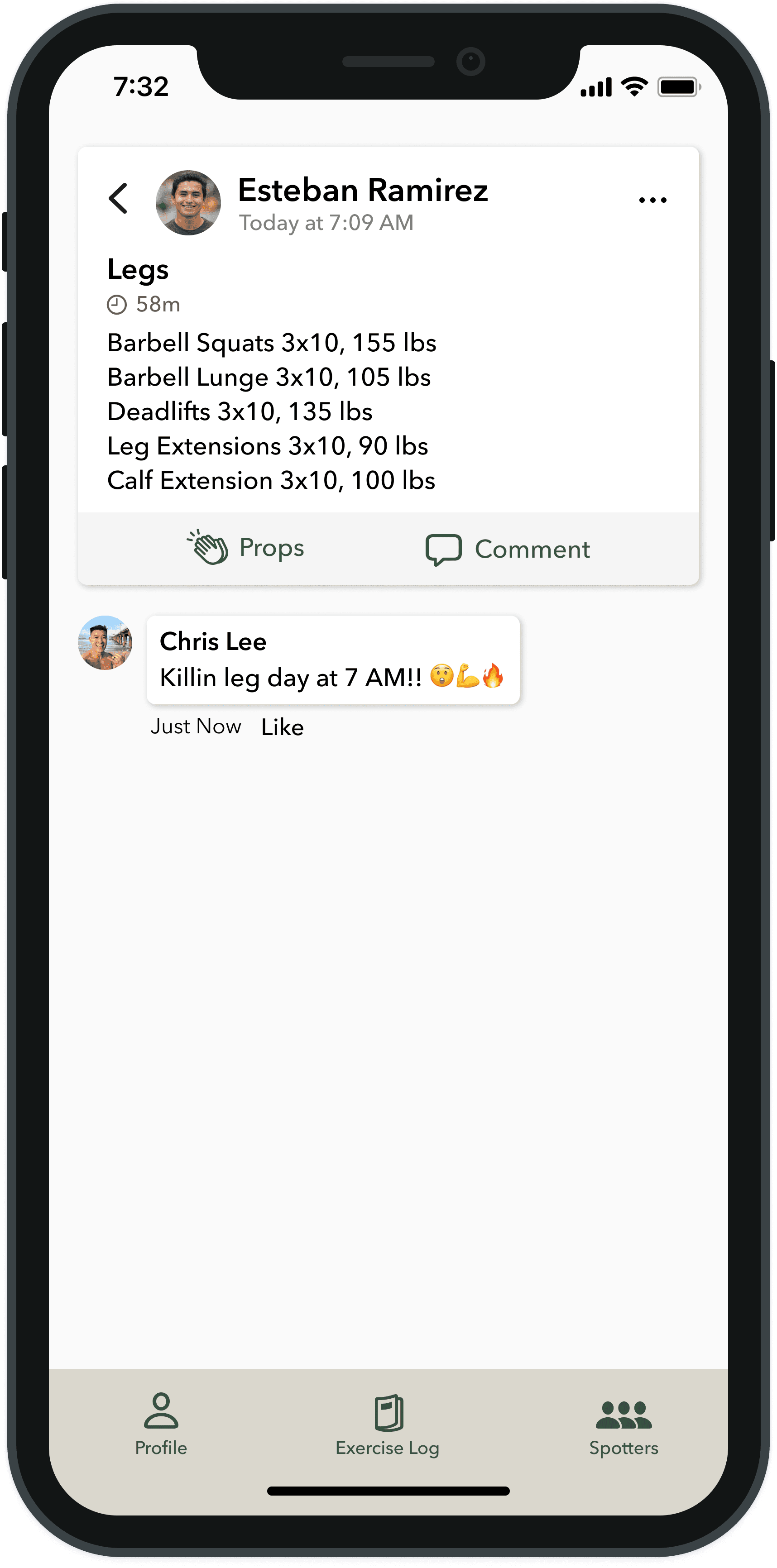
Understand if users can easily comment on and like their friends’ posts in the Spotters section
Understand if users can easily view notifications
Findings
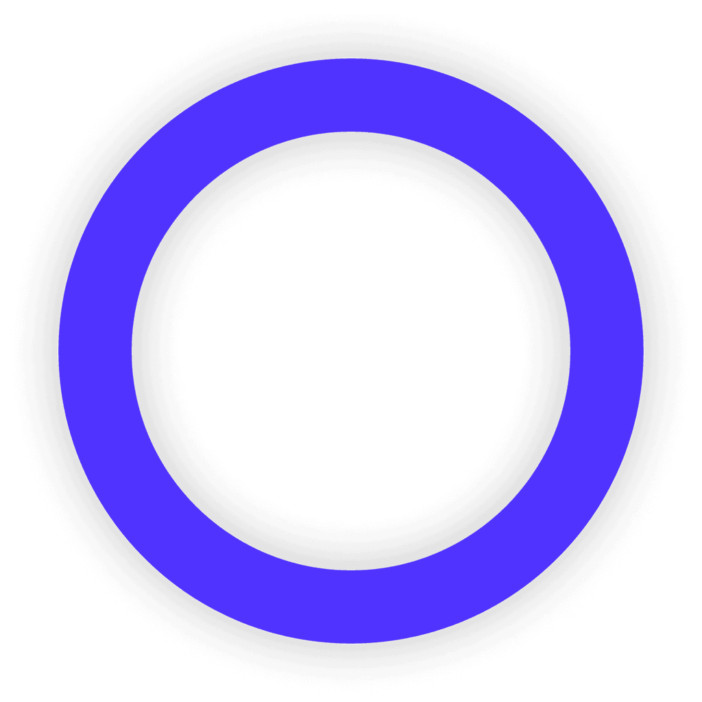
100% of users had difficulty finding the
notification page
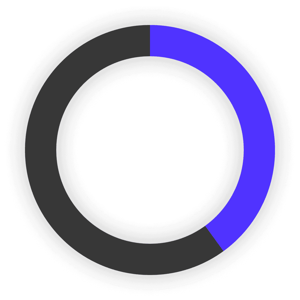
40% of users gave up on finding a friend’s comment and liking it
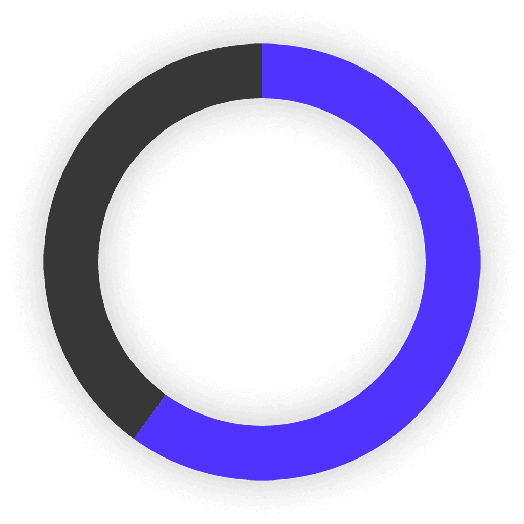
60% of users were unsure what the “Spotters” section in the tab bar was
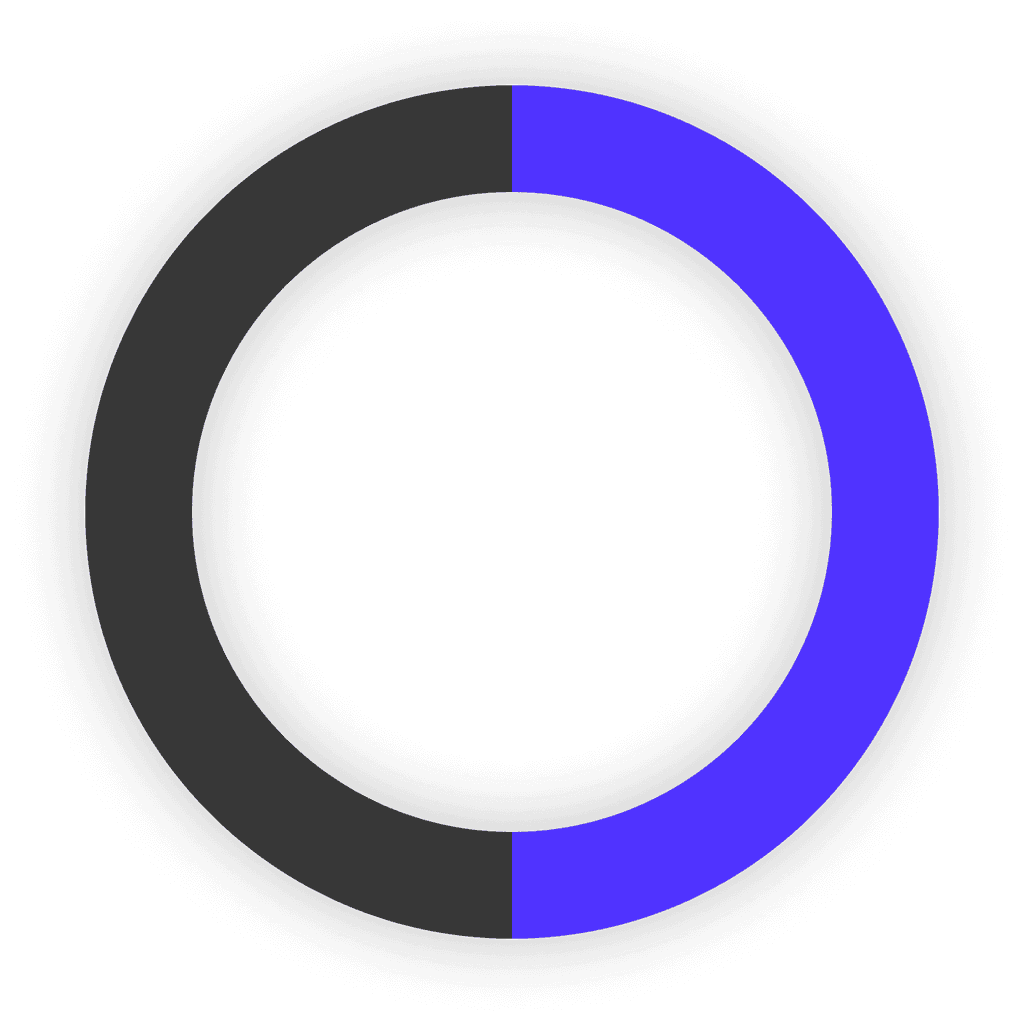
50% of users did not expect to find their past workouts in the “Journal” section in the tab bar
Additional Findings
- Users were able to easily navigate through the onboarding process
- Some users noted it would be helpful to have “back” and “skip” buttons on the onboarding screens
- Some users stated they might want to set multiple goals, but could not
- Users were able to easily comment on their friend’s exercise updates
Iterations in a High-Fidelity Prototype
Branding
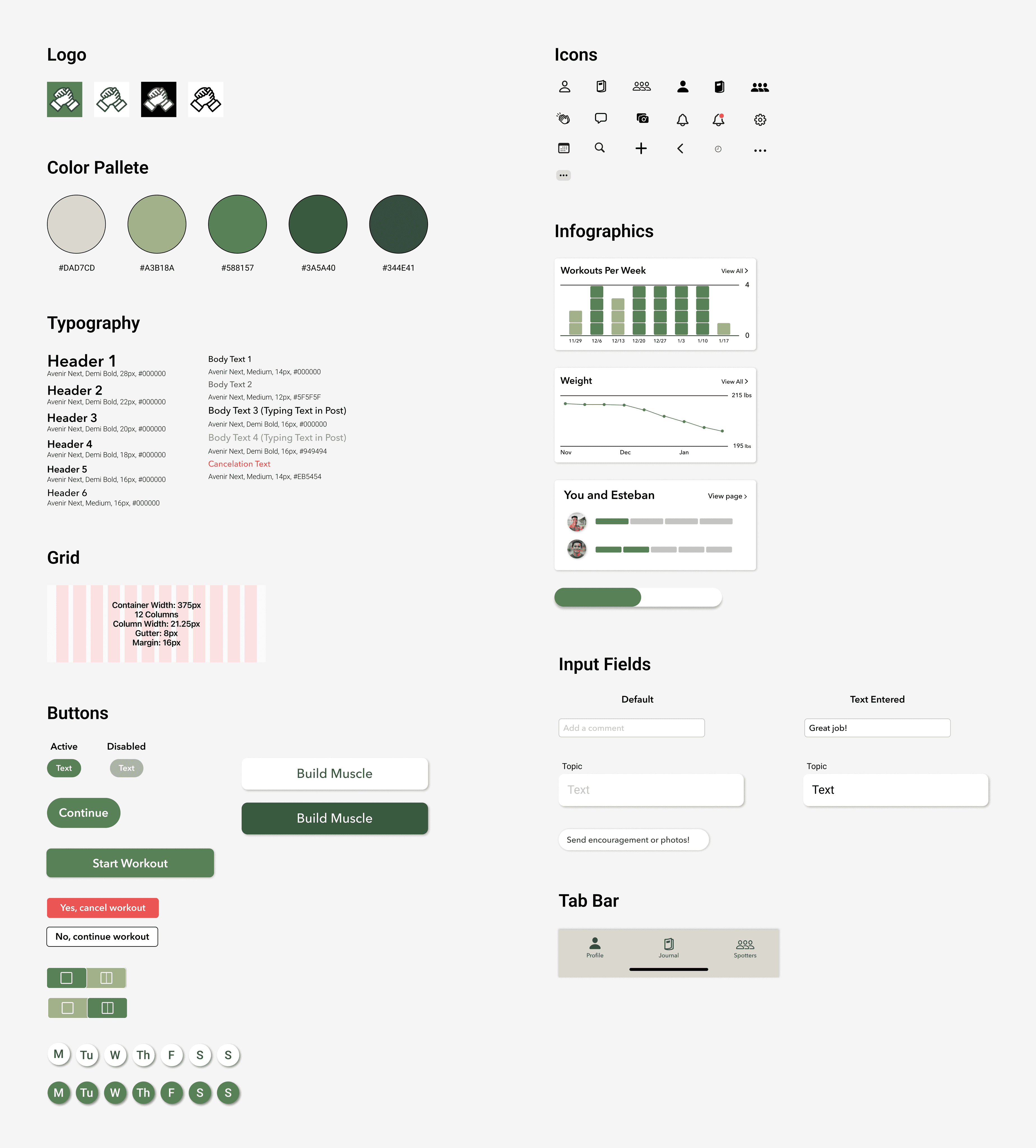
In order to meet the deadline for delivering a high-fidelity prototype, I needed to quickly and clearly define Spotter’s brand before creating high-fidelity designs. Attributes that consistently came up when brainstorming were simple, friendly, modern, and growth-focused. These attributes helped guide the font, color, and logo choice. I chose green as one of the primary colors since multiple research green has shown that the color green can positively affect physical health and motivation (APA 1, APA 2).
Since one of this app’s main differences from other fitness apps is its small fitness support groups, I naturally brainstormed names focused on helping other people. I settled on Spotter, since it is a well-used fitness term that’s related to helping other people.
Style Guide
Iterations
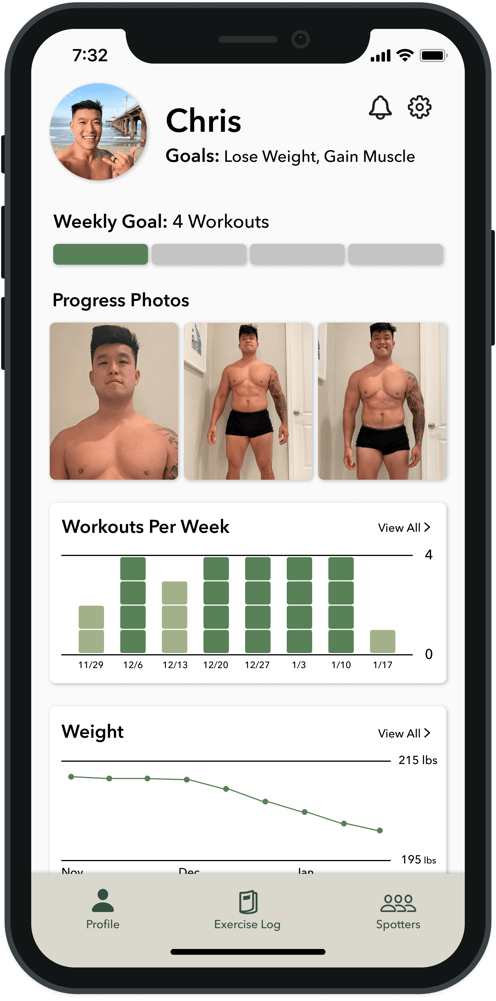
Next, I created a high-fidelity prototype with the following iterations based on feedback from usability testing.
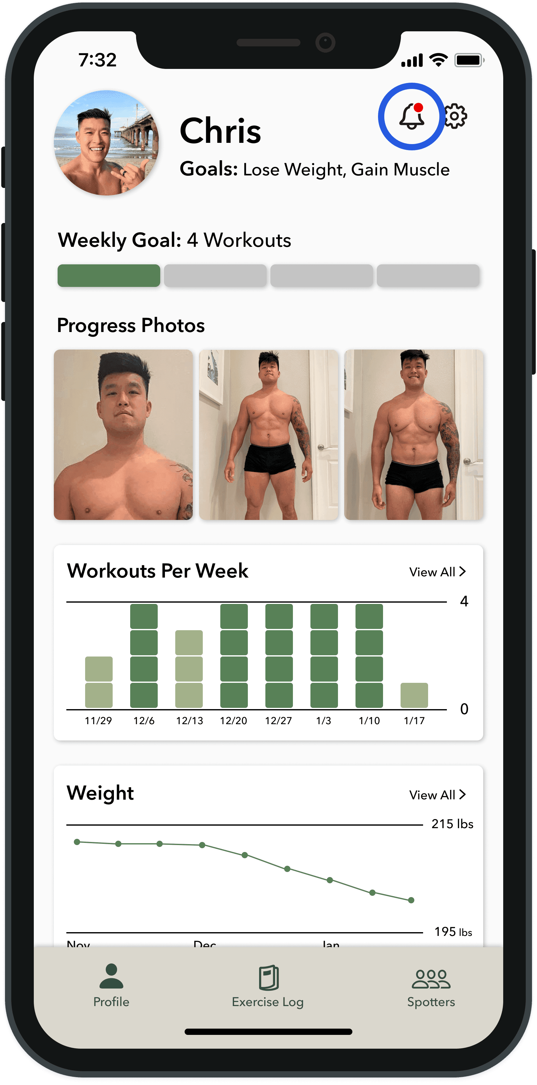
Moved notifications icon to profile section (the home page) and placed a bright red dot on it to make it more visible to users
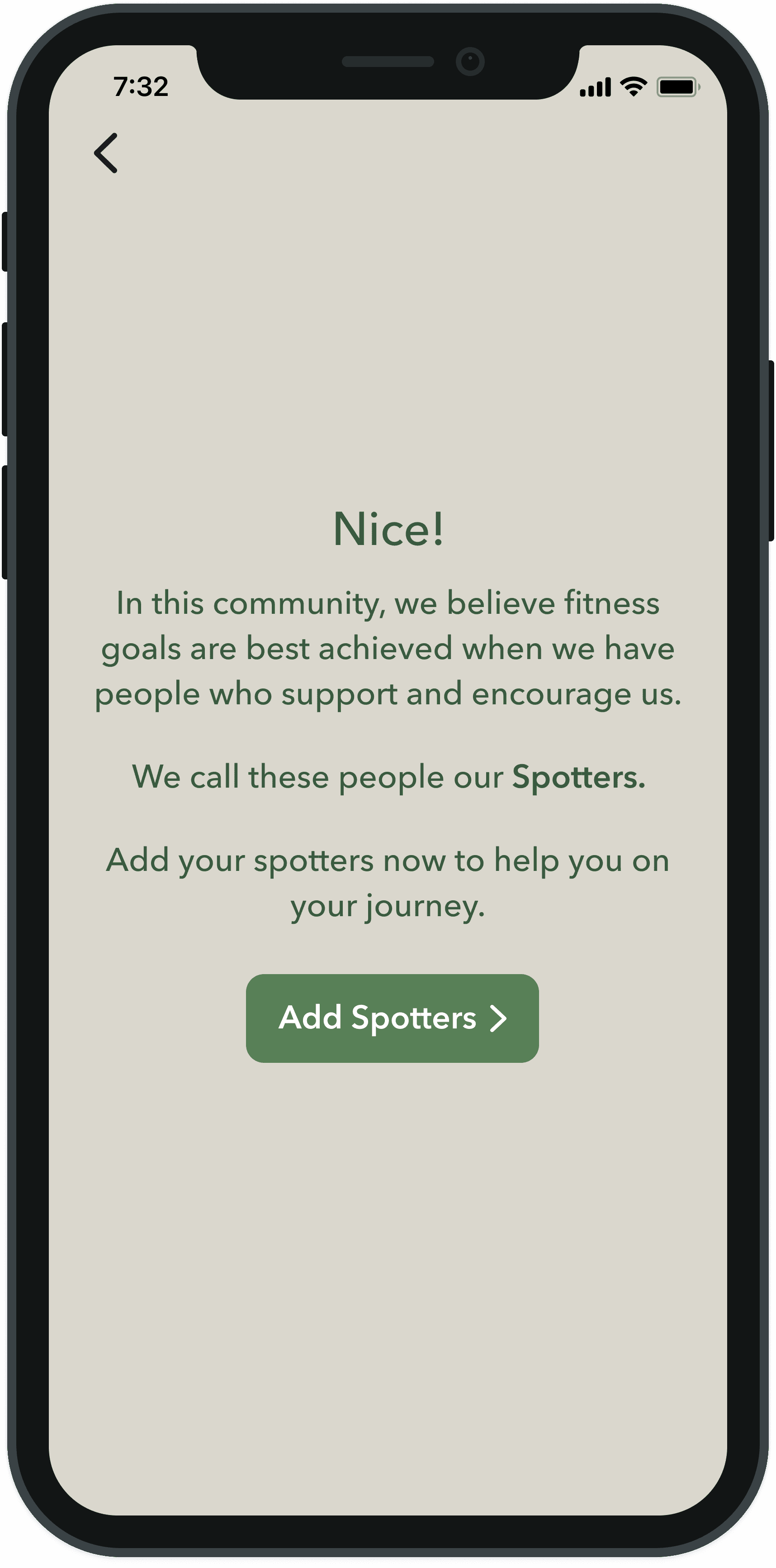
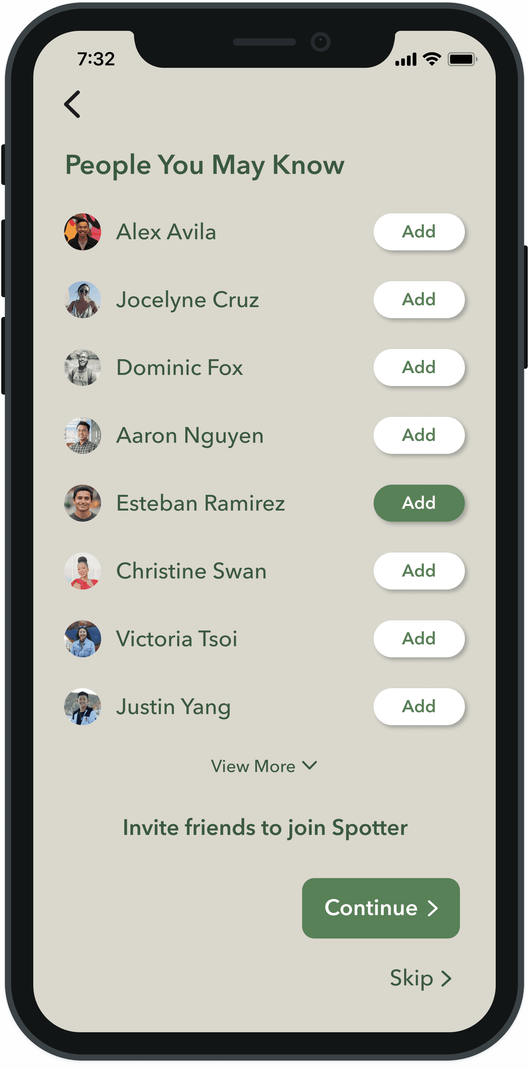
Added a screen in onboarding that clearly explains who “Spotters” are to users and allowed users to easily add Spotters during onboarding
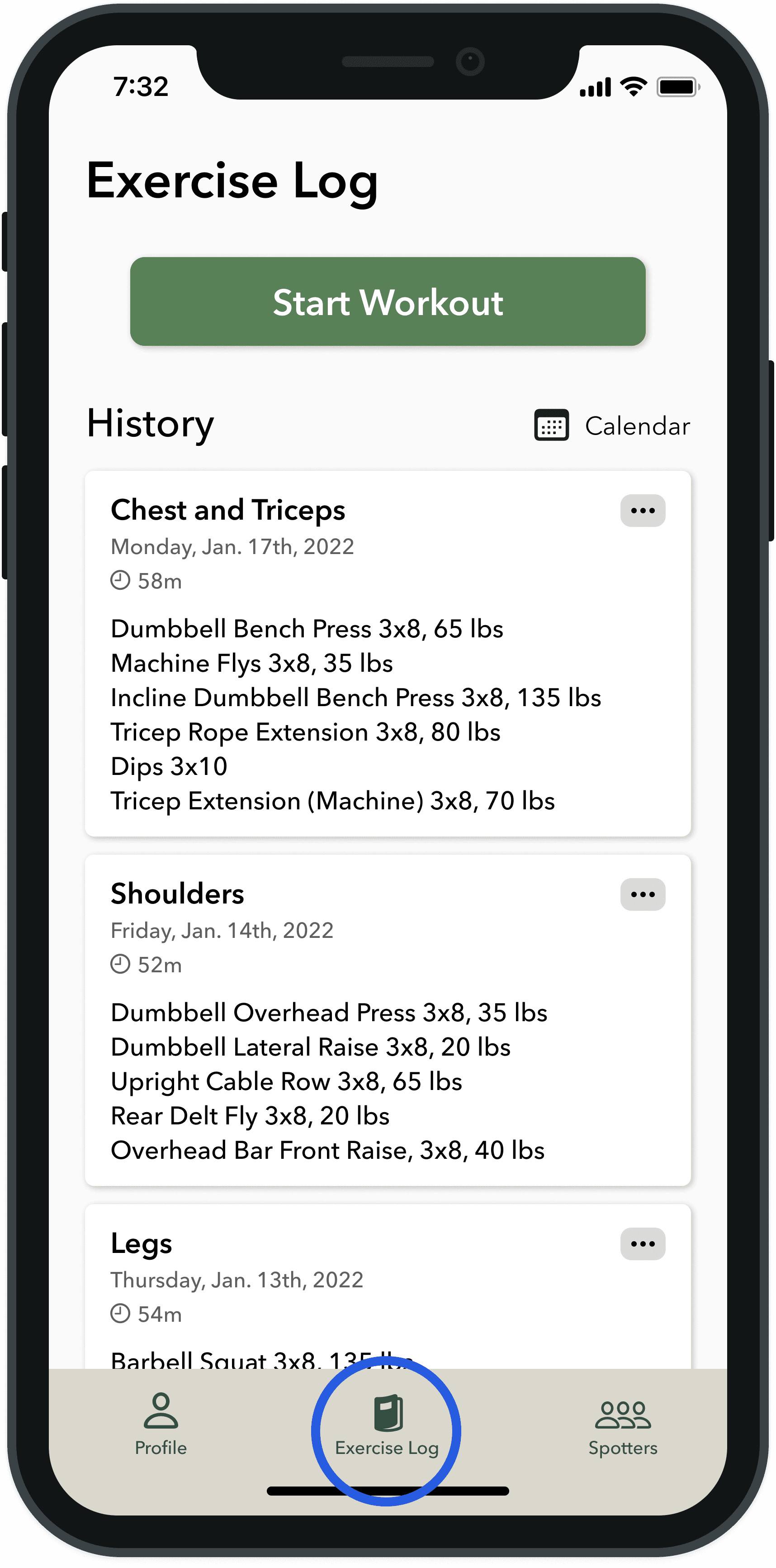
Changed the name of the “Journal” section in the tab bar to “Exercise Log” so users more clearly understand that this is where they can enter their exercise information
Next Steps
With these iterations, Spotter is ready to be handed off to a developer. Once it has been developed, it will be important to monitor if users can easily locate notifications, log their workouts, and communicate with other users in the “Spotters” section.
Beyond this, it could be possible to focus implementing other features, such as a way for users to document pre-set exercises.
Takeaways
Have a robust system for project management
There were several things to track and manage throughout this project. With a limited time frame to create an MVP, I had to make sure I was focusing on tasks that were essential and had my work well-organized so I could quickly access it and meet deadlines. I used Notion to prioritize and track my progress and will continue to search for ways complete complex projects efficiently and effectively.
Display findings and insights in digestible ways when collaborating with others
When brainstorming with other designers about findings, insights and possible solutions, visual diagrams greatly helped me explain who my user is and what problems I was trying to solve. Using diagrams such as How Might We Boards and Impact/Effort Matrices made it much easier to simultaneously and effectively brainstorm with others.
Familiarize users with key terms and concepts when first introducing a product
In usability testing, some users had difficulty completing tasks that included terms that were unique to the Spotter app. This showed how important it is to explain the meaning of unique terms and features to ensure that they can properly test products, which will speed up the overall process of product design and development.
