Cerca
Cerca
Redesigning the Audio Player for a Mobile Travel App
Redesigning the Audio Player for a Mobile Travel App
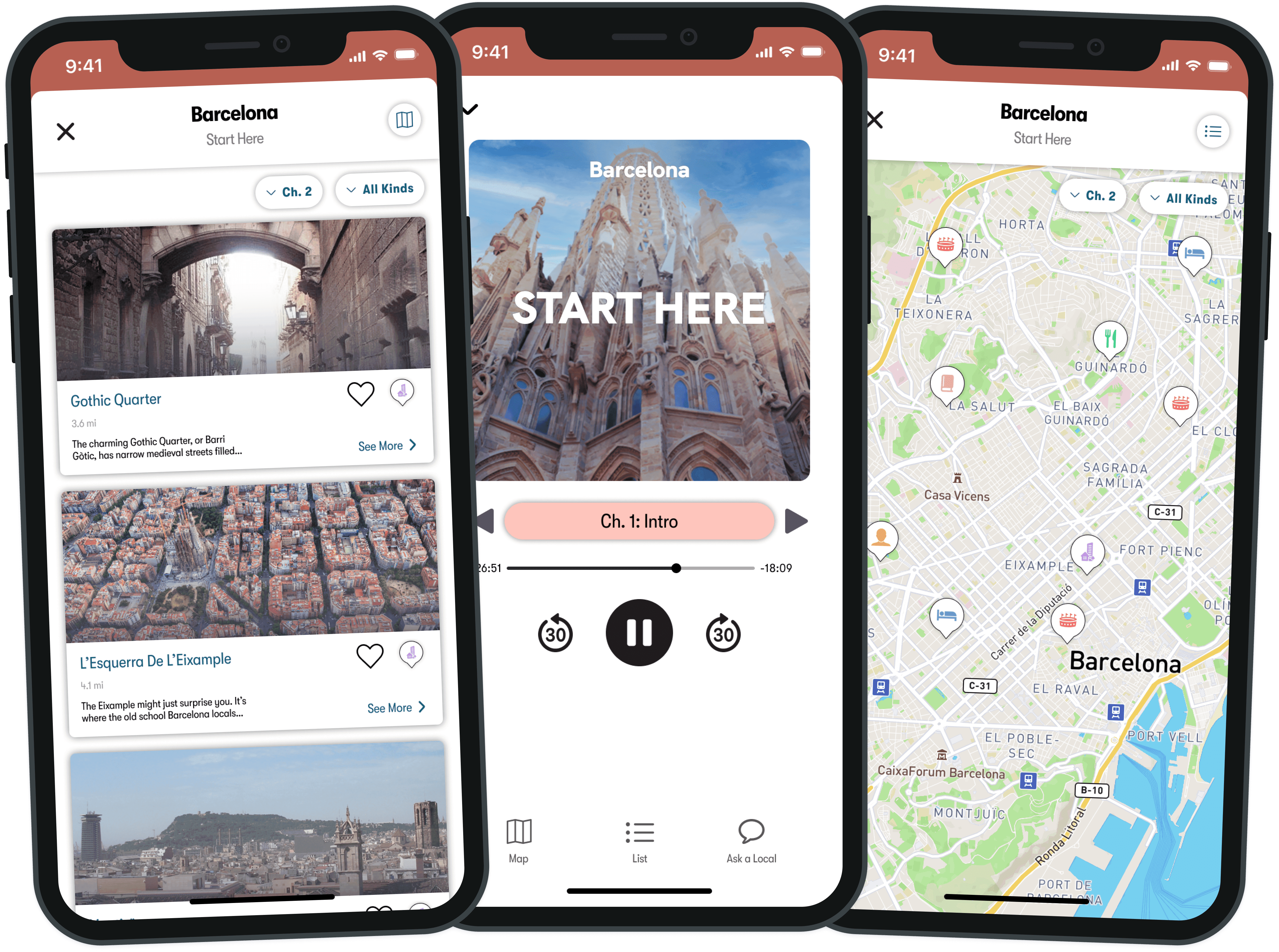
As the lead designer on this project, I analyzed user research, ideated early concepts, ran design sprints, presented frequently to leadership, and delivered final assets for production. I worked with a product manager and engineers and presented to executives.
As the lead designer on this project, I analyzed user research, ideated early concepts, ran design sprints, presented frequently to leadership, and delivered final assets for production. I worked with a product manager and engineers and presented to executives.
Role
Role
Lead UX/UI Designer
Lead UX/UI Designer
UX Researcher
UX Researcher
Tasks
Tasks
Wireframing
Wireframing
Prototyping
Prototyping
Usability Testing
Usability Testing
User Research
User Research
Tools
Tools
Figma
Figma
Miro
Miro
Jira
Jira
Timeline
Timeline
2 Months
2 Months
Project Summary
Project Summary
Cerca is a mobile app that provides both podcasts and information to help users plan great travel experiences. Cerca provides podcast guides and lists of attractions for cities worldwide and connects users to local concierges who can answer their travel questions.
When users are listening to a podcast about a city on the Cerca app, they can view a list of attractions in that city. However, when a user hears about an attraction that is mentioned in a podcast, it often takes them a long time to find that specific attraction listed in the app.
This redesign of the podcast player serves to allow users to easily and quickly find attractions they hear about in podcasts via filtering and ultimately increase the amount of Cerca’s subscribed users.
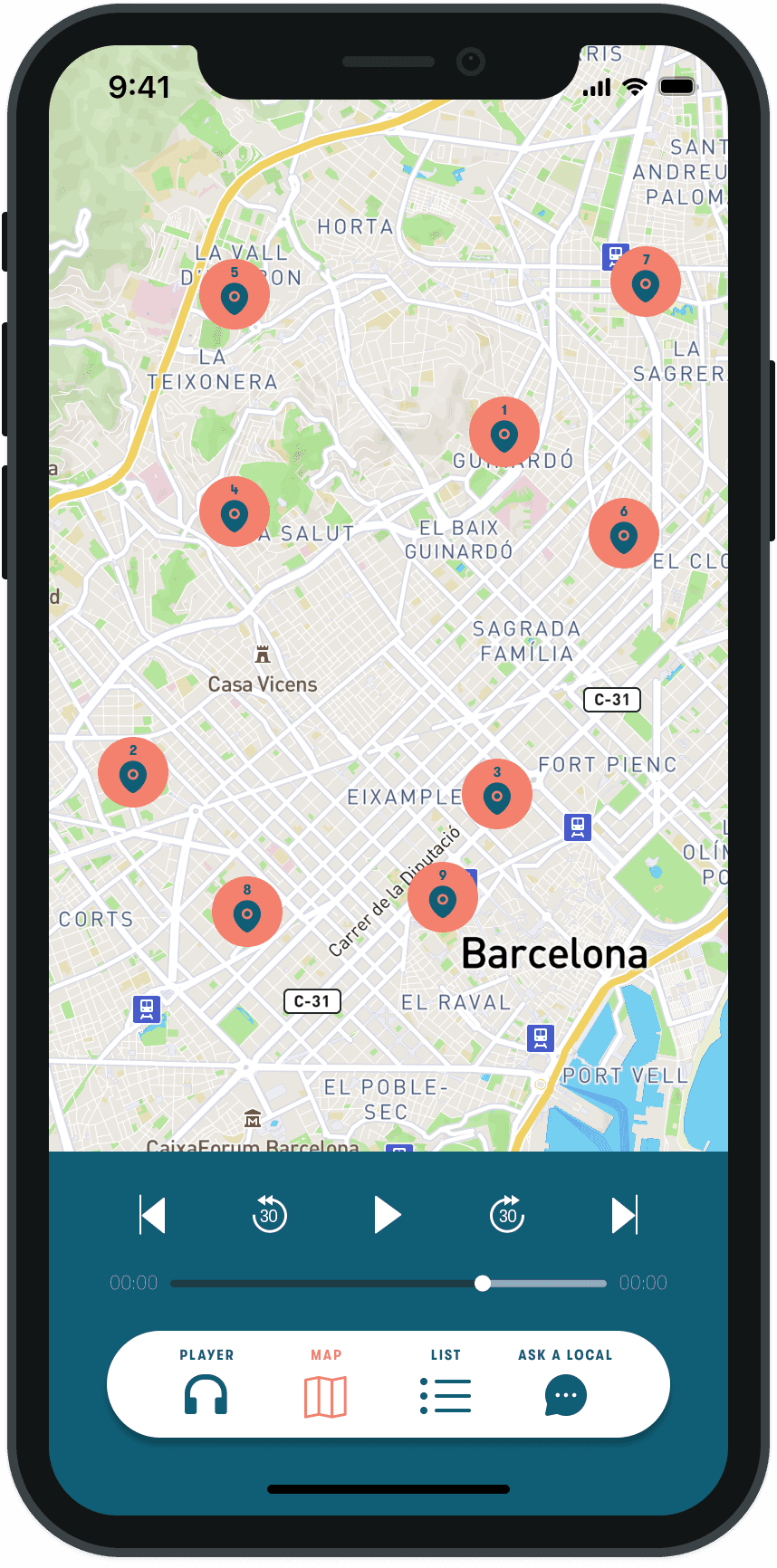
Before
Before

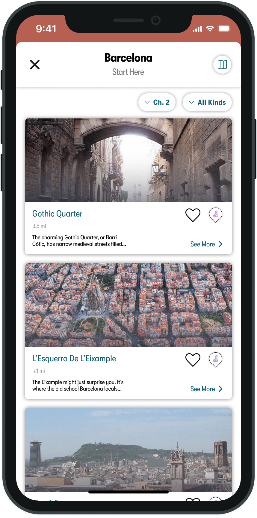
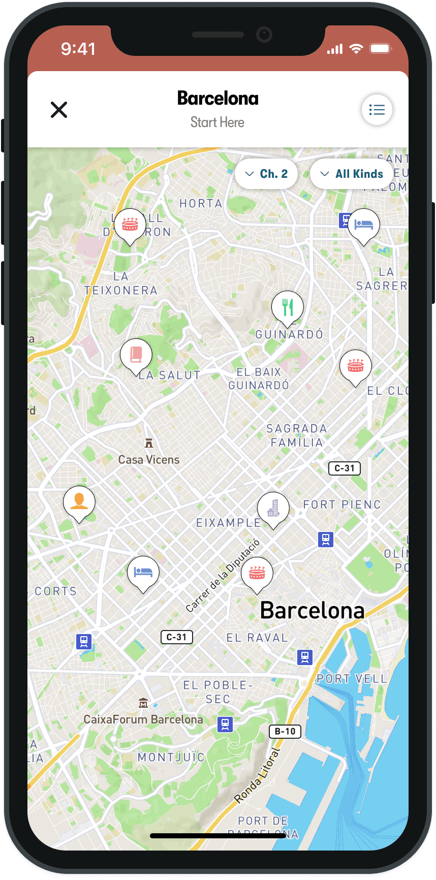
After
After
Problem
Problem
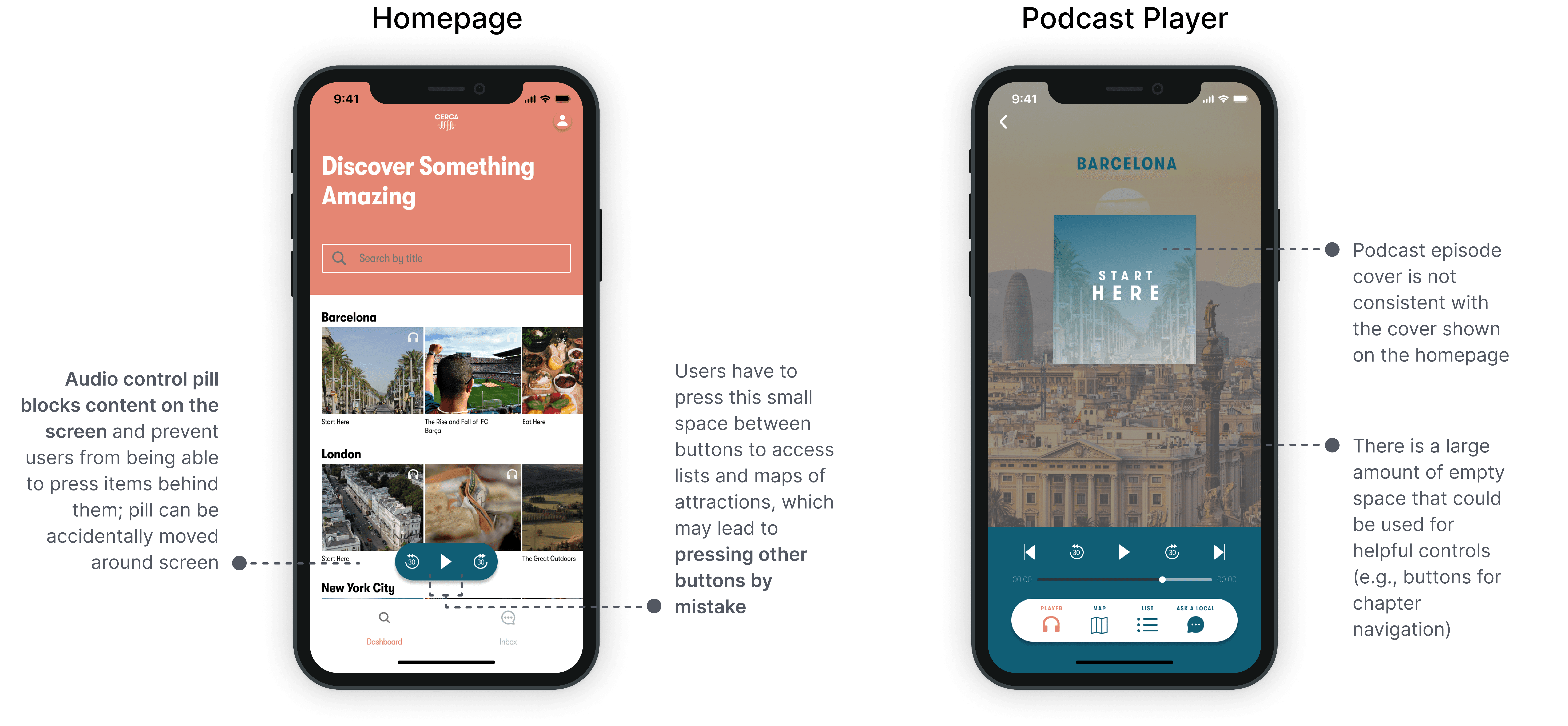
Users tend to take a long time to find attractions that are mentioned in podcasts in the Cerca app. Users have expressed that this is difficult to do because they have to browse through a long list of attractions. In addition, research has shown that users take a long time to find specific attractions in the map view.
Users tend to take a long time to find attractions that are mentioned in podcasts in the Cerca app. Users have expressed that this is difficult to do because they have to browse through a long list of attractions. In addition, research has shown that users take a long time to find specific attractions in the map view.
User Problems
User Problems
Users have difficulty viewing attractions that are mentioned in podcasts
Users have difficulty finding specific attractions on a map
Users have difficulty viewing attractions that are mentioned in podcasts
Users have difficulty finding specific attractions on a map
Breakdown of the Current Experience
Breakdown of the Current Experience

Business Problems
Business Problems
Because users have difficulty finding attractions in the Cerca app:
Because users have difficulty finding attractions in the Cerca app:
Users may not view Cerca as a valuable trip planning product
Churn rate may increase
Users may not subscribe to Cerca’s paid plans
Users may not view Cerca as a valuable trip planning product
Churn rate may increase
Users may not subscribe to Cerca’s paid plans
Goals
Goals
User Goal
User Goal
Allow users to easily and quickly view attractions that are mentioned in podcast episodes in the app
Allow users to easily and quickly view attractions that are mentioned in podcast episodes in the app
Business Goals
Business Goals
Increase the number of total users and subscribed users
Increase the number of total users and subscribed users
Process
Process

User Research
User Research
I analyzed user interviews with 5 of Cerca's users to better understand their needs and pain points while using the app.
I analyzed user interviews with 5 of Cerca's users to better understand their needs and pain points while using the app.
Key Insights
Key Insights
Key Insights
Users want to easily view attractions in a city
Users want to quickly view attractions that are mentioned in podcasts
Users had difficulty finding attractions that were mentioned in podcasts
Users want to be able to plan trip itineraries within the Cerca app
Users want to easily view attractions in a city
Users want to quickly view attractions that are mentioned in podcasts
Users had difficulty finding attractions that were mentioned in podcasts
Users want to be able to plan trip itineraries within the Cerca app
Meeting with Product Manager and Engineers
Meeting with Product Manager and Engineers
I met with the Product Manager and Engineers to identify the highest design priorities, which were:
I met with the Product Manager and Engineers to identify the highest design priorities, which were:
Key Insights
Key Insights
Allow users to easily view attractions in the list and map views after hearing about them in podcasts
Allow users to easily navigate to different chapters of a podcast
Allow users to save attractions
Design a way for attractions to be grouped together
Allow users to easily view attractions in the list and map views after hearing about them in podcasts
Allow users to easily navigate to different chapters of a podcast
Allow users to save attractions
Design a way for attractions to be grouped together
Due to time and resource constraints, it was not possible to implement an itinerary-building feature in the app at this time (user interviews revealed that users would like to be able to plan trip itineraries in the Cerca app). However, we planned to implement a feature that allows users to save attractions, which will set the groundwork for creating an itinerary-building feature in the future.
I worked with the Product Manager and Engineers to establish a time frame for completing these updated designs, set dates for design reviews to receive feedback and decide how the designs would be validated.
Competitor Analysis
Competitor Analysis
I analyzed some of Cerca's competitors to see how they empower users to view information that is conveyed in podcasts and view attractions in cities.
I analyzed some of Cerca's competitors to see how they empower users to view information that is conveyed in podcasts and view attractions in cities.



New Experience
New Experience
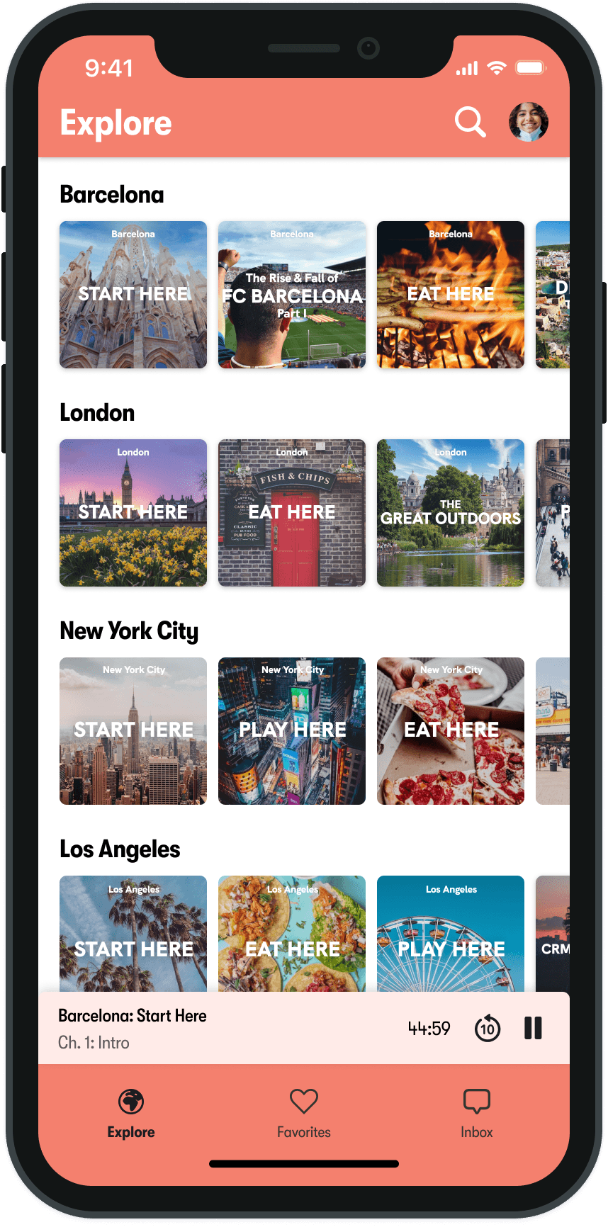
Podcast control bar (bottom): Users can press this quickly to access podcast and attraction details; displays essential podcast information at all times
Podcast control bar (bottom): Users can press this quickly to access podcast and attraction details; displays essential podcast information at all times

Consistent Podcast Covers: Helps users understand what podcast they are listening to
Consistent Podcast Covers: Helps users understand what podcast they are listening to
Chapter Navigation: Users can easily navigate to specific chapters of a podcast episode by clicking the pink pill
Chapter Navigation: Users can easily navigate to specific chapters of a podcast episode by clicking the pink pill


Chapter and Type Filters: Allows users quickly find a specific attraction or browse types of attractions
Chapter and Type Filters: Allows users quickly find a specific attraction or browse types of attractions
Chapter and Type Filters: Allows users quickly find a specific attraction or browse types of attractions
Favorite Button: Users can save any attraction by pressing the heart icon and easily view it in the new "Favorites" section
Favorite Button: Users can save any attraction by pressing the heart icon and easily view it in the new "Favorites" section
Favorite Button: Users can save any attraction by pressing the heart icon and easily view it in the new "Favorites" section
Map & List Toggle Button: Lets users quickly toggle between the map and list views of attractions
Map & List Toggle Button: Lets users quickly toggle between the map and list views of attractions
Map & List Toggle Button: Lets users quickly toggle between the map and list views of attractions
Taller Photos & Hierarchy: Photos give users more comprehensive views of attractions and the redesigned text makes attraction titles more prominent. The distinct borders around attraction cards creates an opportunity for attractions to be presented in groups and improves overall visual hierarchy.
Taller Photos & Hierarchy: Photos give users more comprehensive views of attractions and the redesigned text makes attraction titles more prominent. The distinct borders around attraction cards creates an opportunity for attractions to be presented in groups and improves overall visual hierarchy.
Taller Photos & Hierarchy: Photos give users more comprehensive views of attractions and the redesigned text makes attraction titles more prominent. The distinct borders around attraction cards creates an opportunity for attractions to be presented in groups and improves overall visual hierarchy.

Type-Specific Attraction Icons: Helps users understand what types of attractions are being displayed with a quick look
Type-Specific Attraction Icons: Helps users understand what types of attractions are being displayed with a quick look
Attraction Quick View: Gives users the ability to view the details of an icon without having to leave the map screen
Attraction Quick View: Gives users the ability to view the details of an icon without having to leave the map screen
Removed Bottom Audio Controls: Allows users to view more attractions at once on map and list views
Removed Bottom Audio Controls: Allows users to view more attractions at once on map and list views
Usability Testing & Results
Usability Testing & Results
After these designs were handed off to engineering and shipped, I conducted usability tests to see if these designs were working as intended. Usability testing showed that:
After these designs were handed off to engineering and shipped, I conducted usability tests to see if these designs were working as intended. Usability testing showed that:
Key Insights
Key Insights
Users were able to find and view attractions that they heard about in podcasts more quickly
Users easily understood how to save attractions and view their saved attractions
Users were able to use the new small player on the bottom of the screen to easily view details about the podcast they were currently listening to
The small player did not disrupt users' view of the screen
Next Steps
Next Steps
With this new player design launched, we will monitor the number of Cerca's users and subscribers to better understand these new features' effects on user behavior and retention. In addition, we will weigh the benefits of incorporating an itinerary-building feature in the Cerca app against other top feature priorities.
With this new player design launched, we will monitor the number of Cerca's users and subscribers to better understand these new features' effects on user behavior and retention. In addition, we will weigh the benefits of incorporating an itinerary-building feature in the Cerca app against other top feature priorities.
Thanks for reading!
© 2026 Kyle Hill Designs. All Rights Reserved.
© 2026 Kyle Hill Designs. All Rights Reserved.